Virus Data

People are totally freaked out by the virus, and it is reshaping lives and the future in often unpleasant ways. We know that there is a risk, but we also want to know just how big that risk is. We all want accurate scientific data, but despite a flood of information out there, it is difficult to find really reliable information that is not colored by politics. So here is one piece of information people may find useful.
How do we know if we’re making good progress against the virus? It turn out it is hard to find out. Several of the public metrics that are almost always used are less than useful.
New virus tests: Testing is expanding rapidly, and most of those tested turn out negative. But of course if you test more people you are going to find more that test positive. So it is hard to see trends from that data.
Total hospitalizations: This is also a common feature for graphs, but since those hospitalized may be there for a long period, they are a poor way to show trends.
Deaths: Again, those who die may be hospitalized for a long period. Thus even if the virus magically disappeared tomorrow there would still be deaths in the days to come.
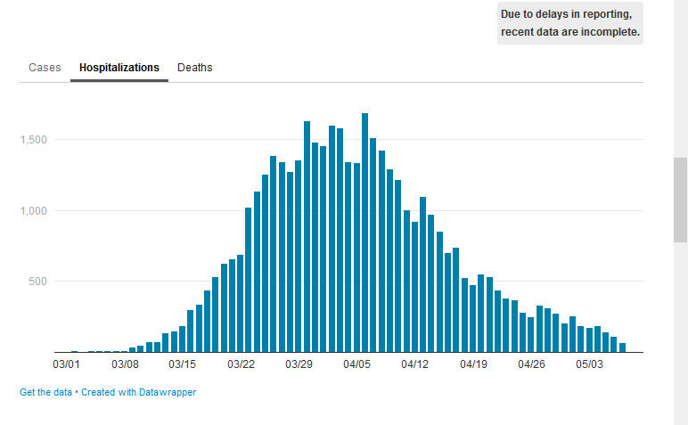
New daily virus hospitalizations: In my view, this is a great indicator for trends. It shows those people that have the virus and are really sick, and it can readily be tracked over time. Unfortunately, many states don’t seem to report this rate, so I was only able to find it for New York City. But that is the hardest hit place in the U.S.
The graph below is from Monday, May 11. But it clearly shows that new virus hospitalizations have gone down rapidly, suggesting that the worst of the problem may be gone. https://www1.nyc.gov/site/doh/covid/covid-19-data.page


